I’m not a web designer by any stretch of the imagination, but sometimes I have to pretend to be one. In a (forthcoming) project, I was looking for a way to divide up the available space within a window amongst various div elements, in a (buzzword bingo!) “responsive design” way. I got frustrated with the complexity of various layout tools I tried, and rolled my own.
It’s ridiculously simple and (being written by someone with very little JavaScript and jQuery experience) may be buggy, but it’s just the thing for the task I was trying to accomplish. It’s yours for free after the break if you have a use for it.
Design Goals
boxLayout is a plugin for jQuery which:
- lets you lay out a set of HTML div elements in a moderately fancy way
- is dead simple to use
- is unlikely to inspire future maintainers to burn you in effigy
- is lightweight (<1KB minified, before compression)
- permits a reasonable amount of customization
- caters for responsive design
- is decently efficient
- is free as in both speech and beer (3-clause BSD license)
There are lots of other layout plugins (and JavaScript libraries, and things like the CSS3 FlexBox working draft) out there, and I all but guarantee that every one of them has more features and options than boxLayout. However, if all you want is a simple layout (that happens to be hard to pull off with plain old CSS), then boxLayout may be what you want.
Download
Source for the plugin and a simple example:
Current version:
- boxLayout-1.1.tar.gz (34KB gzipped tar archive) created 05 June 2015
Old versions:
- boxLayout-1.0.tar.gz (34KB gzipped tar archive) created 04 June 2015
Working Example
You can also play with a live version of the example code included in the source archive above. (Things to try with the example: Resize your browser window. Change between “portrait” and “landscape” proportions in the window size. Use the Firefox “Inspector” or a similar tool to see the div boundaries, computed properties and box model dimensions.)
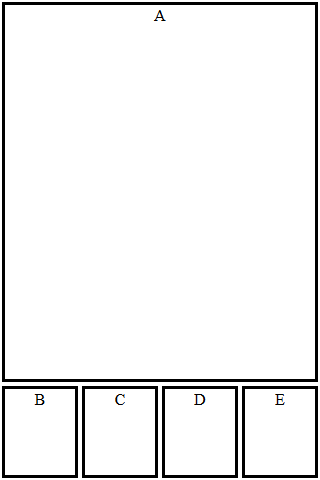
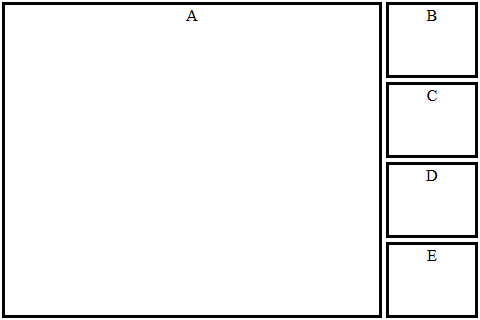
Static screenshots of the example page (with a 320×480 window):
Documentation / How-To
The basic idea of boxLayout is that you start with a parent div with a known id. You then call $.boxLayout('id'); which will set the position and dimensions of all div elements that are immediate children of the parent you specified.
The default is to make all the children the same height as the parent, and to stack them right-to-left in the order they appear in the document. The default width of each child is the width of the parent divided by the number of children.
You can override the default width by giving one or more of the child div elements a “data-box-layout-size” attribute with an integer value. The width of each child will be proportional to the data-box-layout-size value (with children with no such attribute being treated as though they had the value 1). The width of the stack as a whole will exactly fill the width of the parent div.
Size calculation example:
<div id="mybox">
   <div data-box-layout-size="3">alfa</div>
   <div data-box-layout-size="2">bravo</div>
   <div>charlie</div>
</div>
If you call $.boxLayout('mybox'); on the above, then the div containing “alfa” will take up half the horizontal space, “bravo” will get a third and “charlie” will get one-sixth. If “mybox” is 120 pixels wide, then the child widths will be: alfa=60, bravo=40, charlie=20. All children will be the same height as “mybox”.
To get vertical stacking instead of horizontal, use: $.boxLayout('id', true); instead. In that case, the children are all the same width as the parent and stack top-to-bottom in document order. The data-box-layout-size controls the proportion of vertical space given to each child.
boxLayout knows about the CSS3 box model, and includes margins, borders and padding in its calculations.
The size and location of the child div elements are set according to the size and location of the parent at the time you call $.boxLayout(); thus you can create more complicated layouts (like the one in the example) by nesting divs. Set the size of your outermost div first (or let it use its “natural” size, or computed size based on stylesheet or whatever). Use boxLayout to lay out its immediate children, then (once the size and position of the children are set), use boxLayout on them to lay out their children, and so on. Start at the outermost div(s) and work your way in.
The live example page used to produce the screenshots contains HTML like the following:
<div id="outer">
  <div data-box-layout-size="4">A</div>
  <div id="sidebar">
    <div>B</div><div>C</div><div>D</div><div>E</div>
  </div>
</div>
To generate the (landscape) example, we call $.boxLayout('outer', true); followed by $.boxLayout('sidebar'); when the page is first loaded, and whenever it’s resized. The first call gives us a horizontal stack containing ‘A’ (on the left, taking up four fifths of the width) and the sidebar (on the right, taking the remaining 1/5th). The second call subdivides the sidebar, making a vertical stack of B, C, D and E (in that order, each getting a quarter of the available height).
Gotchas / Known Issues
The Mysterious Vanishing Scrollbars
I encountered a problem with the example that took me a while to figure out: When I first loaded the page or (sometimes) after a resize that made the window smaller, the stuff inside the outer div would be too small by about 16 pixels in each dimension. I finally realized what was happening:
- Before my layout() function got called, the stuff on the page was too big to fit in the window. I wasn’t using the CSS “overflow: hidden” property, so the browser helpfully added scrollbars.
- The scrollbars take up space (about 16 pixels on the right and bottom), making the window a little smaller.
- My outer div (width=100% height=100%) scaled to the new smaller window.
- My layout() function carefully arranged everything to fit in the outer div.
- Now everything fits in the window! The browser helpfully removed the scrollbars, making the window bigger again. (This does not cause a resize event.)
- The outer div scales up, but the stuff inside it is still sized and positioned for the old (smaller) dimensions.
All of the above happened too fast to see; I don’t think the scrollbars ever actually got drawn on the screen. It wasn’t until I put a delay between resize() and calling layout() that I figured out what was going on.
Solution: Use “overflow: hidden” if you’re in a situation where the layout process might make the difference between there being overflow and not.
Feedback Solicited
If you use this plugin in something cool, please drop me a line. (To clarify: I’d appreciate it if you did, but you are under no obligation. It isn’t a license requirement or anything like that.)
Bug reports are also welcome and appreciated. (Likewise, reports about better ways to code things or specific things I’m doing that aren’t “best practices”. Did I mention I’m new at JavaScript, jQuery, CSS and pretty much every technology involved here?)
Suggestions for new features are unlikely to be implemented unless they are 1) really useful, 2) don’t impact ease-of-use and 3) don’t add (much) to the size of the plugin. What I’m trying for here is the smallest, simplest, easiest-to-use layout plugin that still does something useful.
Happy Hacking!
2015 June 05 DGH: Moved 1.0 to old versions; added link to 1.1.
Bricklayer is a lightweight jQuery layout plugin that lets you create a responsive, dynamic, fluid, cascading grid layout similar to the popular Masonry or Pinterest web layout.