Did you hear the one about the Aggie who had a truly first-class library of science fiction and fantasy?
The denizens of Texas A&M University take a lot of stick, some fraction of which they may perhaps deserve. As I’m a Rice alumnus, you may believe me when I say I’ve heard (and repeated) my share of the dreadful jokes.
But this post is about one of the places where not only have the Aggies excelled, but have done so within the realm of unqualified, unabashed flat-out geekishness — one of my personal favorite sorts of excellence, and one I deeply admire.
During Aggiecon 39, I managed — through a chain of serendipity and in spite of my own complacency — to get invited on a small tour of the science fiction and fantasy research collection at the Cushing Memorial Library and Archives. I went in assuming it would be an amusing way to pass a couple of otherwise idle hours.
It was one of the highlights of the con.
I’m not a library sciences geek; I’m sure I don’t know the first thing about what to look for, nor the right words to describe it. But the quality of the holdings, the careful curatorship and above all the genuine enthusiasm of the staff for the collection in their care were hard for even a layman to miss.
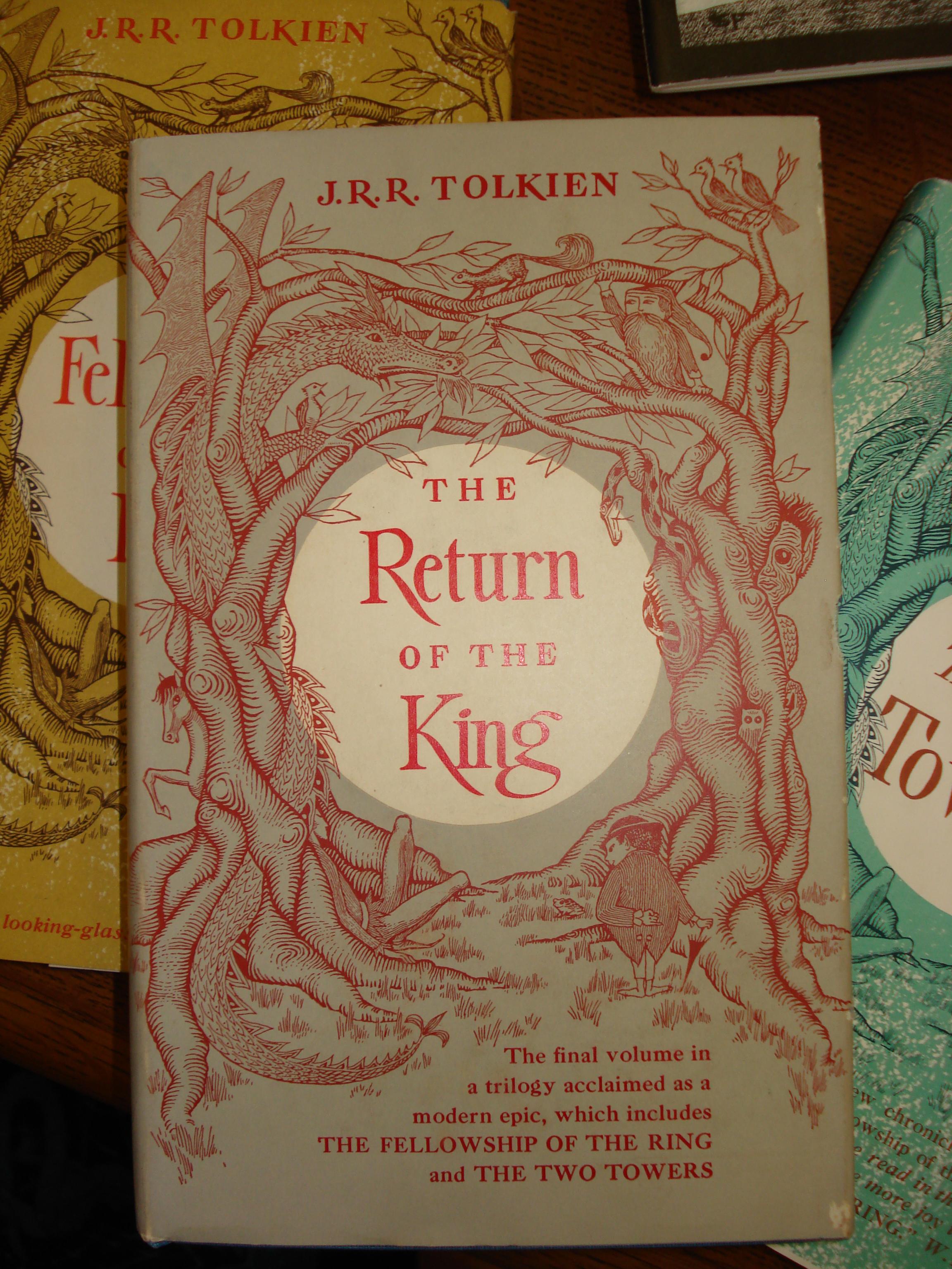
I told you all of that so I’d have an excuse to show you my pictures of the cover for the 1st US edition hardback Return of the King from their collection.
There have been a hell of a lot of different editions of the six-books-bound-in-three-volumes-not-a-trilogy. Enough, in fact, that another altogether separate book has been written to enumerate them. Books have covers, and the history of the War of the Ring in particular offers no end of situations that beg for visual illustration.
Update: There are a number of online galleries of covers, worth visiting but sadly incomplete. (Links to counterexamples would be welcome indeed.)
The covers illustrations run the gamut from tasteful to lurid to psychedelic to extremely minimalist to downright baffling. For the most part, they avoid the worst sins of modern mass-market fantasy cover art.
But this? Right here?
This is how you do a book cover.
I’m not saying that because I love the dragon. That’s a lie, of course. But I’m not saying it just because I love the dragon. The cover, taken as a whole, is extremely effective — it makes me want to re-read this story I know by heart, right now. Just looking at a digital picture of the book on a computer screen makes me want to hold it in my hands, smell the paper and wallow in the physicality of it as much as in the actual words.
There are some great modern artistic interpretations of Tolkien. I’m partial to John Howe, myself. But somehow these simple line drawings (and the author’s own, for example in Farmer Giles) evoke some echo of the aesthetic of the text that all the sweeping vistas and photorealism in the world seem to somehow always miss. They speak of some sort of Anglo-Saxon dreamtime, rich with things unstated but implied: a body of myth like an iceberg, nine-tenths of it hidden.
Maybe it’s just me, but there’s also something about this illustration that makes it very easy to imagine it being a picture created by someone within the fictional world of the stories, a genuine artifact of the fictional world.
Plus, it is a tremendously appealing dragon:
[Edited 2009-09-15 by dhenke to add links to online cover art galleries.]
[Edited 2009-09-16 by dhenke to add link to JRRT’s other artwork.]
[Edited 2010-02-10 by dhenke to remove Amazon links. See explanatory post.]